
|
|
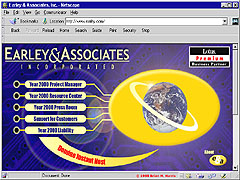
First sketch for Earley and Associates Web Site. The idea was integrated circuitry. This analogy was to be carried throughout the web site.
|
|
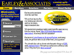
Second sketch for Earley web site. The request was to capture the crisp quality of the IBM site.
|
|
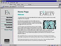
Third sketch for the Earley site. The concept was to take the existing site and apply graphic treatments to improve the look-and-feel, as well as the navigability. This sketch almost made it to the site...
|
|
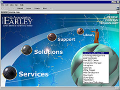
Prototype trying to work with the concept of innerspace.
|
|
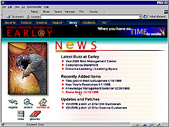
Fourth sketch for the Earley site. This incorporates the latest Marketing emphasis to establish a brand a bring a cohesive look across the print collateral and the web site.
|
|
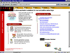
Fifth sketch for the Earley site. The brand sees the light of day. Note the easily recognizable logo, the tagline (people, process, technology) and the neatly wrapped Notes views!
|
|
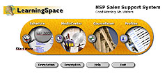
Learning Space customized interface. Integrated this new look on top of a somewhat bland interface.
|

|
The Year 2000 Risk Management System (Y2K RMS). The first versions of this application were prototyped to look goodfor print. Simplified the interface greatly to streamline loadtime.
|

|
|
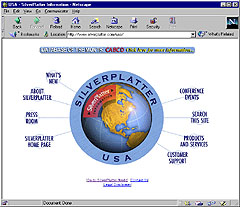
Site design for regional sites. Design was to be incorporated upwards to the global site. Also designed and implemented the search component of the site.
|
|
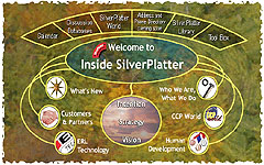
Managed the intranet web site. The design specification was to create an organic interface.
|
|
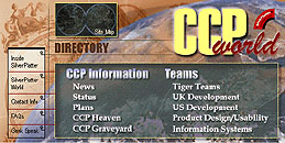
CCP World was the project respository on the intranet web site. Internally, it was where all of the management staff came to draft and post reports.
|
|
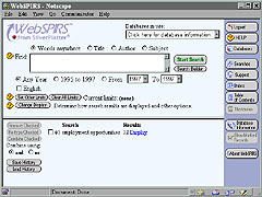
WebSPIRS is SilverPlatter's premiere database search/gateway application. The interface was specified by a product designer and underwent extensive usability testing. The design was augmented to permit customization (changes to the colors and buttons) for branding and language opportunities.
|
|
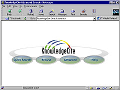
KnowledgeCite was a SilverPlatter spin-off that incorporated Alta Vista software underneath the hood of their bibliographic database search application. This interface was created to match the look of their logo.
|

|
|
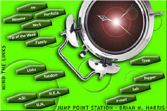
Created in the heart of last February's artic winter conditions, this interface was designed to be warm and engaging.
|